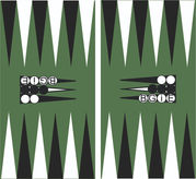
Our logo on boards
An amended version of our logo for the new club boards?

We're back with an update on the club boards (see earlier posts for more background). Later this week we'll be revealing the colours we want to go with, but today we want your thoughts about the club logo for use on the boards.
Our standard logo (on this website and our various materials) has three pip points on it. When we transfer that to the boards we think it looks really crowded, and the direction of the points clashes with the actual points of the boards. So we've developed a one-point and no-point version of the logo as other options.
We have a clear favourite - but we want to know if you have strong views too. If you do - let Sion or Val or Kate or Gavin know. Look at the example layouts above. Do you want to our boards to have:
- a three-point logo
- a one-point logo
- a no-point logo.
Ignore the colours - we'll be talking more about colours very shortly.
Thanks for your views!


